Building and Delivering a Design System On the Fly
The context: The navify Marketplace is the online storefront for navify products, the digital brand of diagnostics leader Roche.
The challenge: Create a scalable, modular design system to unify the navify marketing site and the navify Marketplace, and deliver it iteratively to meet a tight launch deadline.
My role: As UX Lead and Product Designer, I led a team in defining and delivering the system architecture, components, and documentation while coordinating requirements and deliverables with Marketing and Development.
The outcome: A flexible design system powering 14 page templates and 80+ unique pages in Storyblok.
-
12 months
Project duration
-
3 Designers, 7 Devs, 1 PM
Team size
-
Figma, Storyblok
Tools
-
UX Lead & Product Designer
My role
-
Q1 2025
Launch


Original marketing website for the navify brand
Setting the Stage
navify is Roche’s line of digital solutions for hospitals and laboratories. Up to this point, the brand’s marketing site and its online storefront, called navify Marketplace, had existed as standalone websites, and now needed to be unified under a single platform with a refreshed look.
As UX Lead for navify Marketplace, I led a team of two other designers and myself in creating a design system that could support developers in building the website and marketers in creating content and mockups for the site. This meant that we would need to build a system that was flexible, future-proof, and was thoroughly documented.
The Challenge
We weren’t just delivering a system—we were delivering it in real time. With a tight go-live deadline, the development and marketing teams would need to receive materials and guidelines as soon as possible to begin their work.
Design, Development and Marketing all joined the project at the same time, so instead of delivering a finished system, we would have to hand off our progress as we went.
In order to navigate this difficult situation, we created a plan to prioritize system pieces by urgency, deliver modular work early, and revise continuously—all while keeping quality and consistency in check.

Using a modular approach allowed us to create a layered system
The System Layers
We set out to create a robust design system in Figma that would be modular, flexible and ensured consistency across the final website. In order to do that, we structured our system into four layers:
Foundations
Components
Modules
Templates
While the company already had a centralized design system in place, it had been built primarily for laboratory applications, which have very different goals and aesthetic needs than a public-facing marketing platform. So we treated that system as a starting point, reusing what made sense, adjusting where needed, and introducing many new patterns tailored to our use case.
As we didn’t count with the luxury of time, we couldn’t wait to finish one layer to get started with the next, so after laying the foundations of the system, we jumped between levels depending on what devs and content creators needed next. We worked in a fast-moving, iterative way that introduced uncertainty into our work, but allowed us the flexibility we needed to deliver in time.
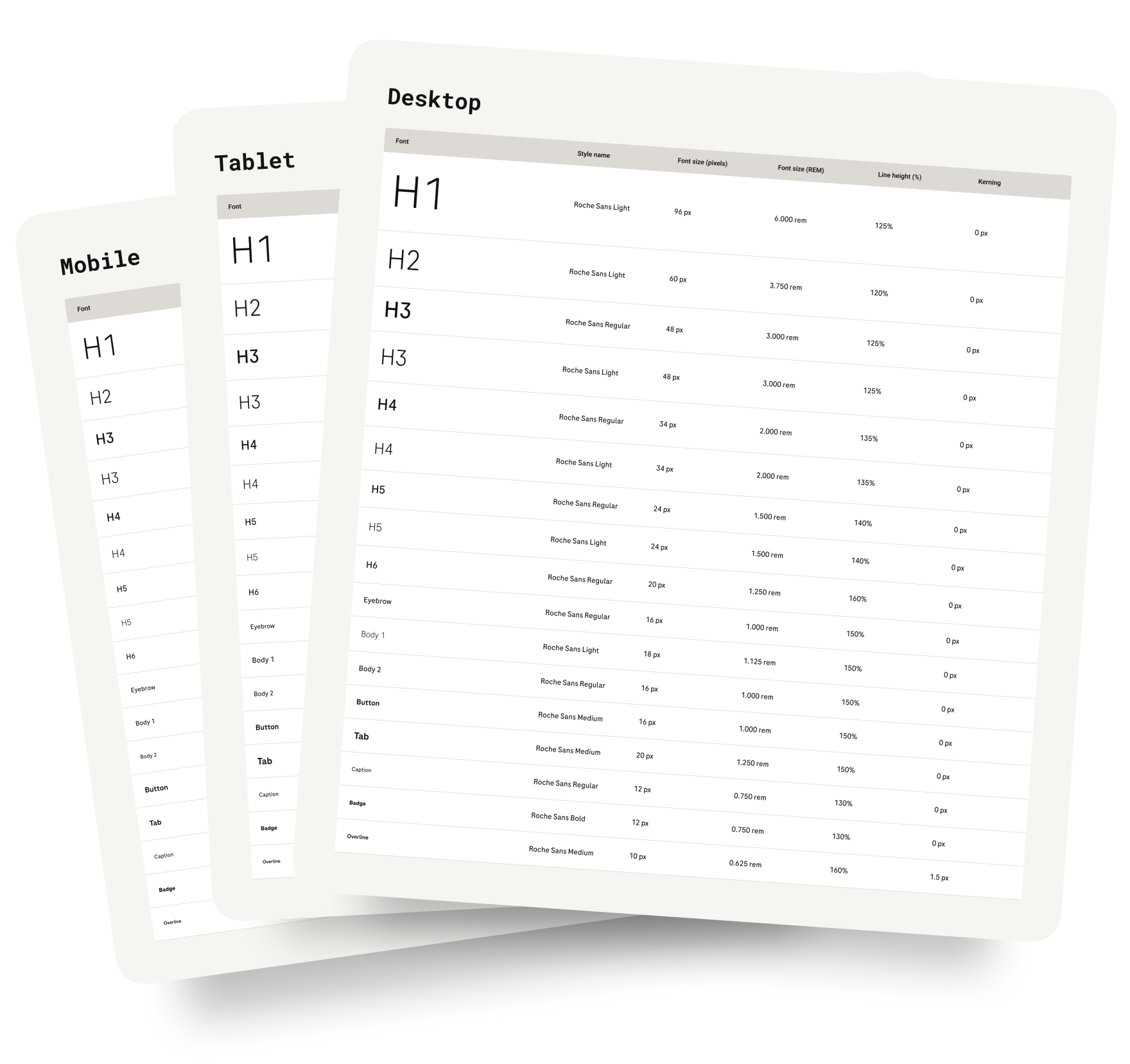
Type scales were optimized for a variety of device types.
Foundations
This layer covered the base elements of the system: typography, color, spacing, and responsive grids. We began by referencing the foundations in the company’s existing design system, then made thoughtful adjustments to better serve the needs of our marketing site.
We refined the type scale to achieve a sleeker look and stronger hierarchy between heading styles, anticipating the demands of the content-heavy pages to come. On the color side, the navify brand needed to be a primary element. Since it was only used as an occasional accent tone in the main design system, we extended the navify palette and created tokens for every use case, ensuring accessible combinations across both light and dark backgrounds.
For responsive layouts, we aligned with Tailwind, the framework that the Development team had chosen. We defined six different breakpoints and created 12-column grids for each one, committing to designing every module across all breakpoints to ensure the best experience on every device.
All the foundation values were turned into primitive and semantic tokens, and implemented as variables and shared styles in our Figma library to support consistency and scalability.

Each component was broken down into all possible its states
Components
This layer included the core building blocks of the site: buttons, text fields, dropdowns, and other basic UI elements. Component work moved in parallel with foundation and module development, evolving as the needs of the site became clearer.
Our initial plan was to reuse components from the company’s official design system. We pulled in instances of the originals, mapped out the variants we needed, and directed the dev team to the source documentation for implementation.
But as we started building the first modules, the gaps became obvious once again. These components were designed for internal lab tools, not a marketing platform, and so they didn’t match our visual goals and were way too complex for our functional requirements.
With approval from the design org, we changed course. We created custom components that preserved the original structure where useful, but simplified variant logic and adapted the visual style to better suit our platform. Since the dev team was already rebuilding everything in React, this shift didn’t create extra work—in fact, it made implementation more efficient due to the simplified structure.
This conscious departure allowed us to stay true to brand principles while building a system that actually fit the context it was made for.
Modules
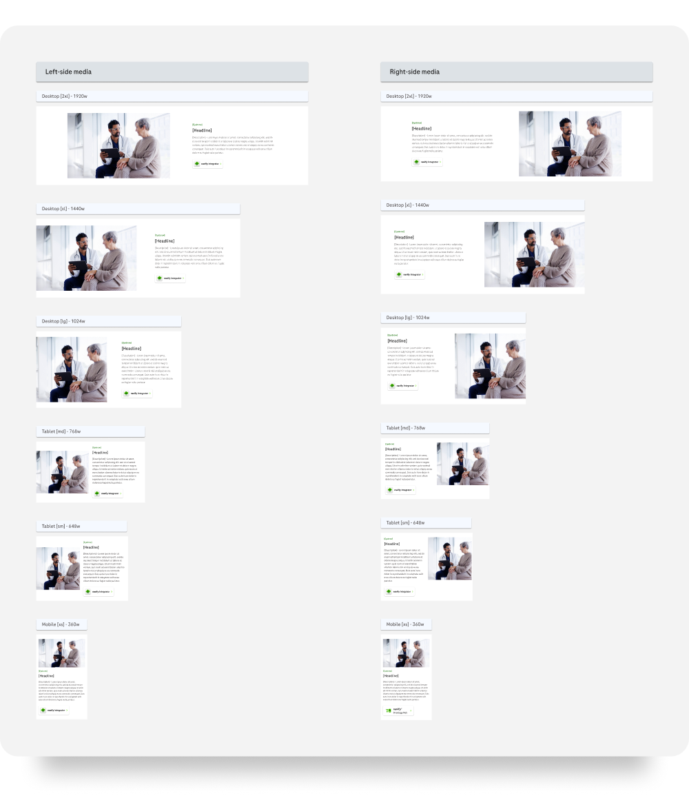
All modules supported six different breakpoints.
We began this layer by breaking down the redesign’s mockups into content patterns, which would become the basis for our module library. This approach allowed us to create reusable building blocks that could be combined in different ways to support a wide range of pages.
Each module was built from the ground up as a single Figma component, following the responsive grid system we had defined, with variants representing each of the six breakpoints we had committed to. We considered using variables and modes to handle breakpoint changes, but the differences between large and small layouts were too significant. Still, we applied a hybrid approach wherever layouts could be reused across breakpoints and differences were limited to spacing or styles.
To make our modules robust and easy to maintain, we relied on a variety of strategies:
Variants for layout options, like aligning media to the left vs. right.
Nested components for shared patterns like CTA and text blocks, or media areas with rich controls.
Boolean properties, instance swaps and sub-component variants to allow for deep customization of modules.
Consistent internal structures, with standardize layer naming across variants, and Auto Layout powering every every layout.

Templates provided a structure for future content pages.
Templates
Page templates were designed to guide content creators without constraining them. Our goal was to define flexible page-level structures they could rely on, while still giving them room to adapt the layouts to the needs of each specific page.
We started by analyzing sample content provided by the marketing team to understand the intent and messaging of each page type. From there, we defined sections based on those needs and mapped each one to the modules best suited to support them.
Every template had a defined structure made up of required and optional sections. Within each section, we listed the modules that could be used, and in some cases, a recommended order. These rules helped keep the design coherent while giving creators the flexibility to tailor each page.
In total, we delivered 14 page templates and over 80 unique page instances, all mocked up in Figma and assembled in Storyblok by the marketing team using the system and documentation we built.
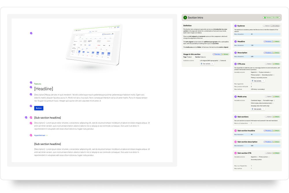
Every module was accompanied by detailed usage documentation.
Documentation Everywhere
Documenting the system was just as important as building it. Since our components were highly flexible, we needed to make sure both developers and content creators understood how to use them properly, and how not to.
For content creators, we documented every template with example pages and exploded views that broke down each section and module into smaller parts. We defined which elements were mandatory, what modules were allowed where, and how each variant worked. We included character count guidelines, content rules, and notes on configuration. As questions from Marketing came in, we continued to adapt the documentation to make sure everything they needed was covered, including listing which component configurations were actually available in the CMS to prevent mismatches between Figma and production.
For developers, we created handoff documentation manually for every component and module, since the dev team didn’t have access to Dev Mode in Figma. It was a time-consuming process and the manual approach meant that late changes sometimes broke our annotations. But because the system had been thoughtfully structured from the start, we were able to consistently document sizing, spacing, behaviors, states, keyboard navigation, edge cases, variants, and responsive breakpoints in a way that scaled as the system grew.
Closing the Loop
This project was never about building a perfect system up front. It was about building the right system over time. What started as a scramble to meet a tight launch deadline turned into a collaborative, cross-functional effort that delivered far more than a single website.
We now have a design system tailored to real content and real constraints, built with structure but flexible enough to evolve. Marketing can publish with clarity and consistency, and developers have a reliable library built on shared foundations. And we as designers now have not just a system, but a framework for how we approach systems: thoughtful, modular, and deeply documented.
The work isn’t over, and we’re prepared for that. The website will continue to grow, and as needs shift, we’ll continue to adapt, supported by a solid foundation and a process that values momentum over perfection.
What I Learned
You can’t always work linearly, but a system can evolve with just-in-time priorities if you keep it clean and modular.
Good documentation cannot be an afterthought. It’s a part of the product itself when multiple teams use the system.
Design systems aren’t just design, they're an invaluable tool for designers and stakeholders.