Rethinking Analytics for E-commerce Shops
The context: Folksy, a UK-based craft marketplace, launched a new seller analytics dashboard that was met with frustration from its users.
The challenge: Understand why the redesign failed and explore how a new approach could actually support sellers in running better, more profitable shops.
The work: Discovery and UX design, including research synthesis, product definition, and interface design.
The outcome: A redesigned analytics experience tailored to sellers’ real goals, focused on sales insights, contextual events, and actionable patterns.
-
Folksy
Company
-
Figma, FigJam
Tools
-
Product Designer
My role

Original Folksy anlaytics panel
Context
Folksy is an online marketplace for independent craftspeople in the UK. In 2022, they released a redesigned analytics dashboard for their sellers, and it didn’t go over well. Within days, complaints began appearing on the seller forums. Some users felt the old dashboard had been more useful. Others said they no longer understood the numbers. Across the board, there was a clear signal: the new design wasn’t meeting their needs.
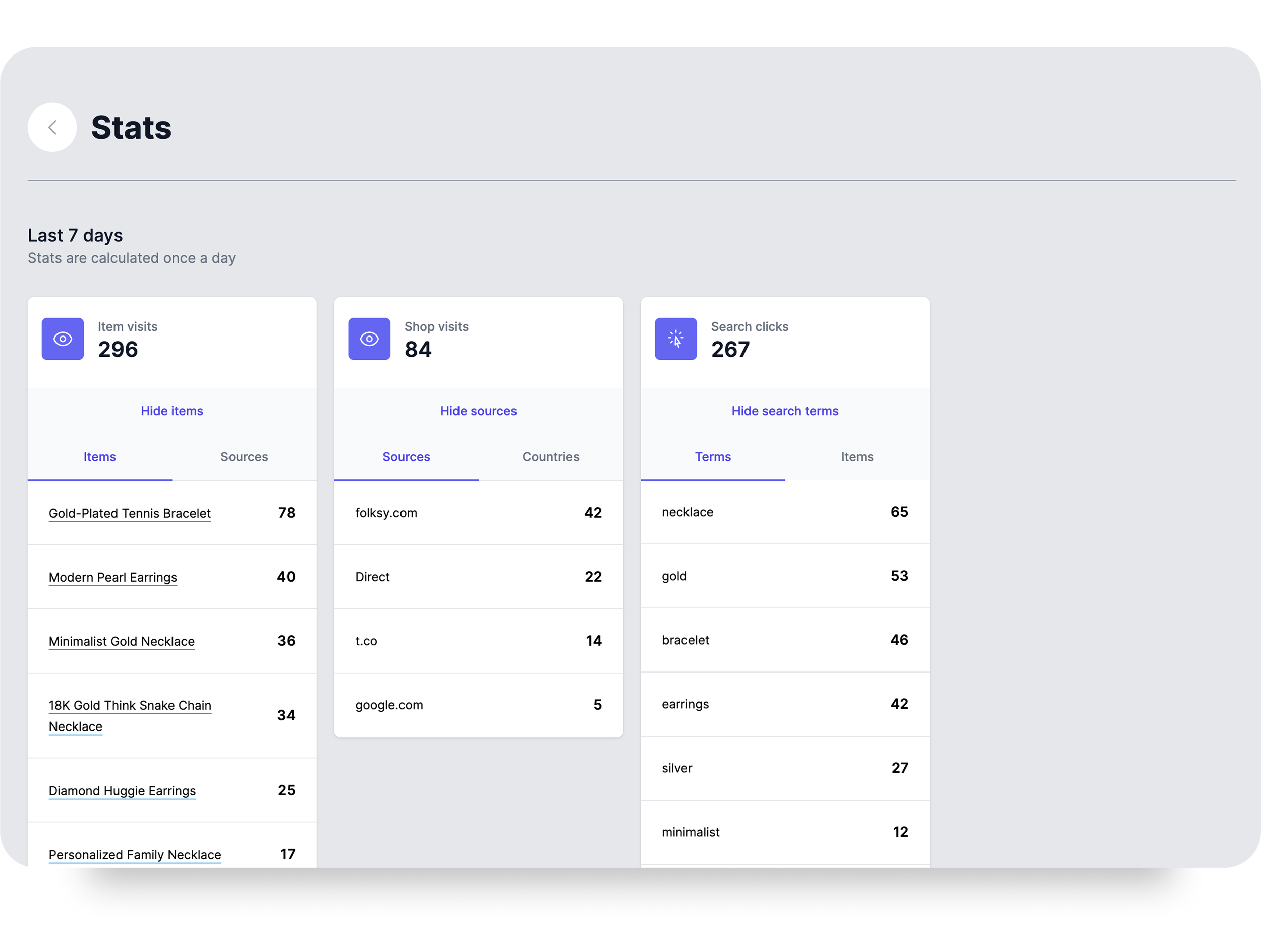
At the time, analytics offered only a basic overview, consisting mostly of traffic sources, page views per product, and a list of search terms, and sellers expected more than that. They wanted insights into sales, revenue, and trends. They wanted to know what was working, what wasn’t, and how to improve. The platform’s limited metrics, paired with the ability to only see metrics from the previous week without any context, left many sellers frustrated and disengaged.
Objectives
This project was an exploration of how Folksy’s analytics dashboard could be reshaped into a genuinely helpful tool. The goal was to help sellers understand how their shop was performing, identify areas for improvement, and feel more confident running their business.
From a business perspective, the platform stood to gain by reducing user dissatisfaction and enabling more sellers to succeed, both of which could drive overall revenue growth.

Affinity mapping helped in structuring user feedback
Discovery
To ground the redesign in actual user concerns, I turned to the seller forums and reviewed dozens of real messages, collecting as many data points as I could. Not just complaints, but also how users described their workflow, what questions they hoped analytics would answer, and which external tools they turned to when the platform fell short.
Key insights
After breaking down the forum posts into individual insights, I used an affinity mapping approach to surface common themes. Most frustrations pointed to the same issues:
Too much focus on page views, while sellers were more interested in sales and revenue.
Lack of flexibility due to a fixed 7-day view for all analytics, with no flexibility in choosing timeframes.
Missing context to help sellers interpret the numbers the numbers they were seeing.
Many sellers turned to Google Analytics, but most found it too overwhelming to configure.
There was also a general sense of confusion. Without comparisons or historical benchmarks, even basic numbers like “views this week” left sellers unsure of what to do next.

The redesigned analytics panels brought relevant information to the forefront.
Design
With a clearer picture of the pain points, I began outlining what a more useful version of the analytics experience could look like.
The new dashboard would shift focus from passive stats to actionable insights. Time flexibility would be built in from the start. I also decided to unify shop-level and product-level data within a single flow. In the previous version, these were split into separate sections, which was a structure that made sense on paper, but in practice caused more disorientation than clarity.
I also aimed to preserve the look and feel of the platform’s latest visual refresh, building on the updated design language and keeping things familiar for sellers.
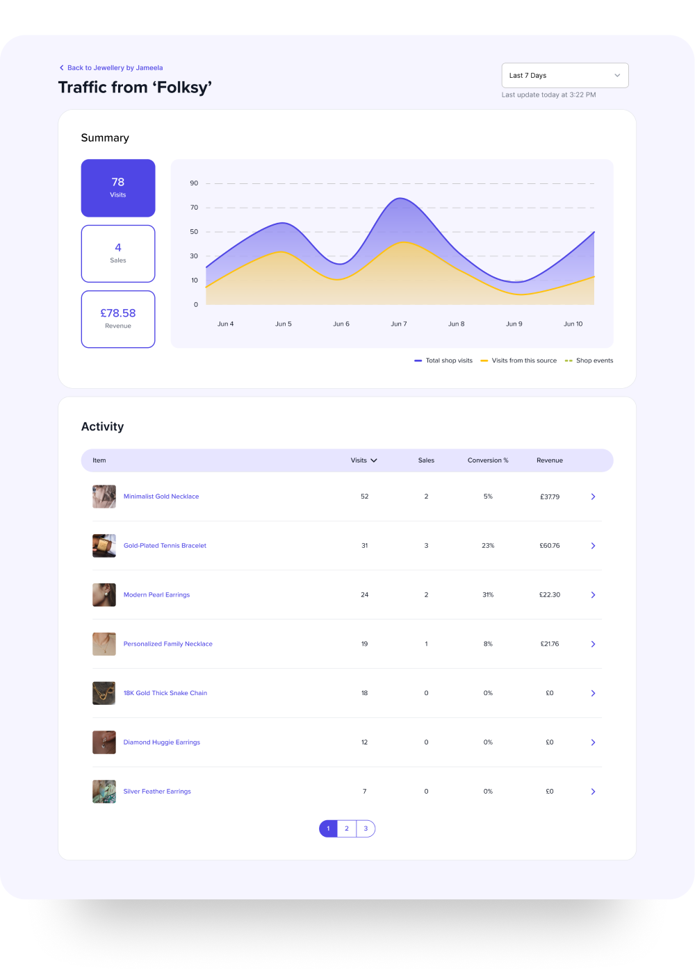
The redesigned analytics dashboard gives sellers a clear, actionable view of their store performance, while offering the ability to drill down when needed. The redesigned analytics experience consists of a comprehensive dashboard for the shop, with a high-level overview that highlights visits, sales, and revenue over a customizable timeframe.

Dashboard overview
A dynamic line chart breaks down the shop’s key metrics and allows detailed exploration of data points through tooltips available on hover.
Events, such as the shop being featured on Folksy’s homepage, are marked directly on the timeline, helping sellers connect changes in performance with specific triggers.
The dashboard allows the user to select the timeframe they are interested in from a list of presets, or by defining a custom time period.

Activity by product
Beneath the overview, a product activity table provides a quick scan of which items are contributing most to the shop’s performance. Each product shows its views, conversion rate, and total revenue. Clicking into a product opens a dedicated view with deeper stats, including its own chart that compares product-level activity to the overall store.

Traffic & search insights
Traffic sources and search terms also received a redesign. Sellers had complained that the old method of displaying URLs made them unreadable, so traffic sources are now cleaned up and labeled clearly. The traffic section uses a bar chart to visualize how each source contributes to overall visits, and each source can be clicked into for a full breakdown of its impact on the shop.
Similarly, the search terms section includes a list with pagination controls of the terms that led to shop visits, with a graphic breakdown using a bar chart.

Product detail overview
Product detail view
From the main activity table, users can drill into a specific product to see how it’s performing in the context of their overall shop. The dashboard filters all data to that one item and overlays product metrics against shop-wide performance for comparison.
The overview chart displays key events at both the shop and product level, helping users understand how specific changes or promotions may have influenced performance. Hovering over the chart reveals a detailed tooltip with metrics for that date, covering both product and shop activity.
The Traffic Sources and Search Terms modules are also scoped down to only reflect data for the selected product, giving users a focused view of what’s driving interest and sales at the item level.
Traffic source overview
Traffic source detail view
Just like with products, users can drill down into a specific traffic source and see visit and purchase data for that specific channel. This breakdown allows users to see how visits, sales and revenue evolve over time for a specific channel, and includes a detailed table showing how much activity each product has received from this channel.
What could come next
If this work were to continue, there are clear next steps to build on the foundation. Sellers could benefit from guidance or suggestions based on trends in their data. For example, highlighting underperforming products or recommending promotions. It could also be helpful to let sellers manually log their own events, such as social media campaigns or seasonal changes, to better understand how outside activity influences store performance.
Finally, exploring ways to track missed opportunities, such as visits without conversions, could help sellers understand where they’re losing customers and how to adapt.
What I learned
Unstructured user feedback can be translated into clear product direction.
Analytics can easily become irrelevant if they aren’t grounded in user goals.
Providing context and guidance creates meaning and clarity.