Streamlining Search and Filtering in GitLab
The context: Some of GitLab’s main flows heavily utilize filtering and free text-search to process pages with long lists.
The challenge: GitLab’s filtering tools were falling short in terms of usability, flexibility and scalability due to a rigid model based on dropdowns.
The work: Through incremental releases, we overhauled the filtering experience with a smart bar that unified text search and filtering.
The outcome: A more intuitive, powerful, and scalable filtering experience that’s now used across GitLab, and continues to evolve.
-
3 months
Project duration
-
1 Designer, 1 PM, 1 Dev
Team size
-
Sketch
Tools
-
Product Designer
My role

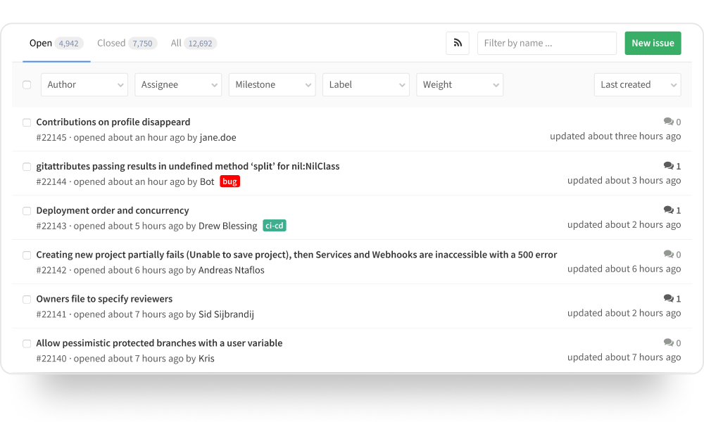
Original filters in GitLab’s issue list
Setting the stage
GitLab is a platform that supports the entire DevOps lifecycle, from ideation to delivery and integration. Many of its primary workflows involve pages with long lists of content, like issue tracking, merge requests, release plans, or automation pipelines. Filtering is essential to make those lists usable, but the existing tools had reached their limits.
The filtering system was built around a row of dropdowns, with a separate text box for search that floated nearby. This separation made search and filtering feel like two unrelated tools, and the horizontal layout could not handle more than a few filter types before overflowing. The dropdowns themselves had their own drawbacks: when closed, they were unable to display all chosen values for multi-select filters, and once a selection was made the filter’s label disappeared, leaving users to guess what the dropdown represented.
Although it would have been possible to fix each of these problems in isolation, that approach would only have addressed symptoms rather than solving the deeper usability issues. This became an opportunity to rethink search and filtering as a single, cohesive system that could handle many more use cases.
A unified search bar would replace the existing filters and text search
Rethinking the Model
The new solution would have to achieve a few key things:
User should perceive search and filtering as part of the same system.
The design needed to be reusable across many kinds of pages and scalable accommodate a growing range of filter types and values.
Lastly, it should give users a clear view of which filters were active at all times.
With these requirements in mind, a unified search bar with smart parsing emerged as a solution with great potential. If the system could analyze a search string and recognize syntactic patterns as tokens, filtering could be integrated right into the search functionality, affording users total flexibility.

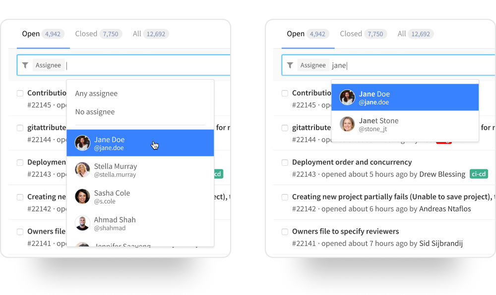
A suggestions menu opened activating the unified search bar
Helping users craft queries
Token syntax was designed to follow the modifier characters that were used throughout GitLab, like “@” for users and “~” for labels, which ensured consistency across the platform. A token therefore consisted of a keyword identifying the filter type, followed by a colon and the filtering value. For example, a token identifying user @jane.doe as the author, would be “author:@jane.doe”.
But a fully text-based interface is not a usable solution if users don’t know the syntax to use. To make building queries approachable, activating the search bar through mouse or keyboard interaction would display a suggestions menu.
This menu showed the available filter types on the current page, while teaching users the expected syntax right within each row.
The suggestions menu could be operated through mouse or keyboard
Supporting different working styles
Selecting an option in the suggestions menu would open up a secondary menu with possible values for that filter type. For example, the assignee menu would display a list of users, with the active user at the top of the list, as well as other special options like “Any assignee” or “No assignee”.
The smart search bar supported different working styles. Users could click through the menus, which emulated the functionality previously provided by dropdowns, they could navigate through the menus using the arrow keys, or they could type queries directly.
All suggestion menus narrowed down the available options as the user typed in the bar. For example, typing “jane” while the assignee menu was open would show all users who had the string “jane” in their full name or username, highlighting the matching characters.
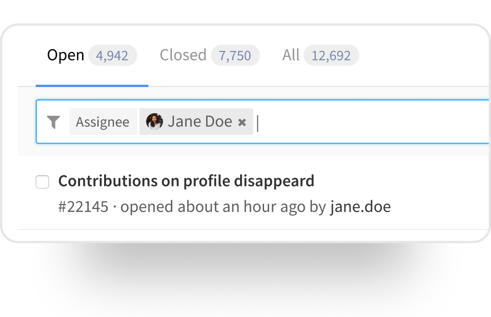
Filters added to the bar were displayed as rich token chips
Token chips for clarity and control
Once a filter value was confirmed, it appeared in the search bar as a token chip, which included visual cues such as avatars for people or label colors, making them easy to recognize. Clicking a token reopened its value menu for quick editing, while clicking the x icon removed it entirely. Keyboard editing was also supported: placing the cursor after a token and pressing backspace would break it into editable text, and continuing to delete the text would remove the token completely.
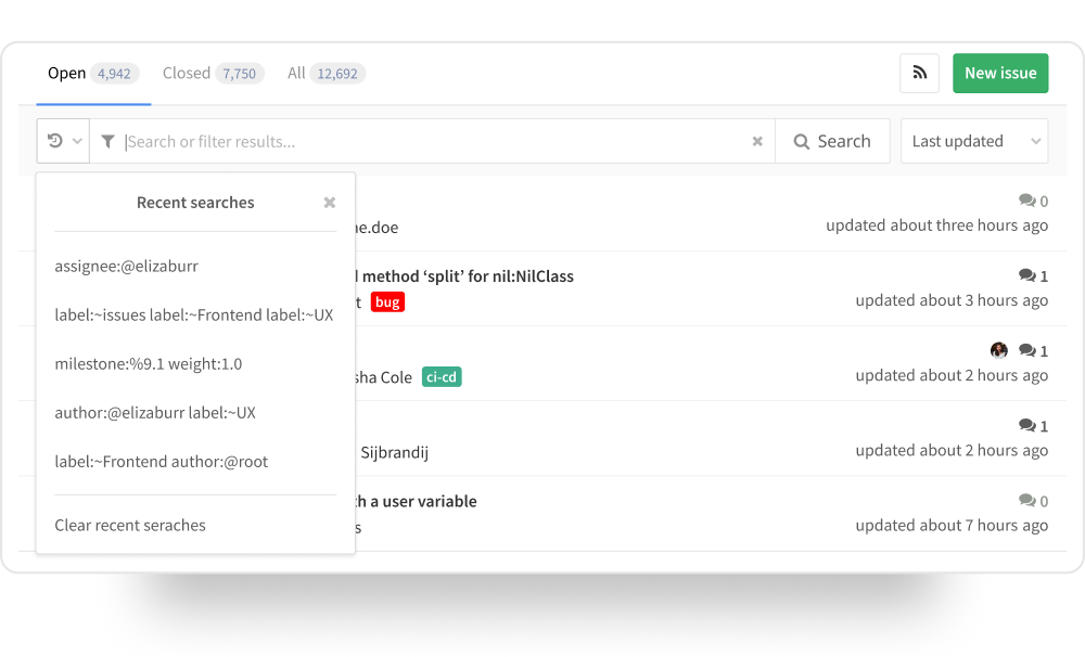
Improvements after launch included a recent searches menu and a more direct way to submit a search.
Iterating After Launch
Like every GitLab feature, the smart filter bar was first released as an MVP, giving users a working version they could start using right away and provide feedback on. Early engagement in GitLab’s public issue tracker proved invaluable, guiding targeted adjustments that made the design faster, clearer and easier to use.
One of the first changes addressed confusion around the how to run a search. The original design included a row in the suggestions menu reading “Keep typing and press enter” as a submission cue, but users found it unclear. This was replaced with a familiar search button built directly into the bar, while still allowing queries to be submitted with the Enter key.
Other enhancements targeted efficiency. A “Clear all” control made it possible to reset a query in a single click, and a menu of recent searches that made it easy to revisit previous work without reconstructing queries from scratch. The suggestions menu was also updated to open automatically after a token was added, enabling users to add the next filter immediately, wichi made building complex queries much smoother.
These small, early changes significantly increased the usefulness of the smart filter bar, underscoring how valuable it is to act quickly on feedback while the design is still fresh.
A More Capable and Flexible System

The new system allowed for the creation of complex queries, combining filters and text search.
Merging search and filtering into a single interface solved long-standing usability issues while creating room for growth. The architecture was deliberately designed for scalability, which has allowed the number of filter types to more than double without sacrificing clarity or ease of use. Since its introduction, the smart filter bar has allowed for the introduction of negating filters (e.g. “author is not @janedoe), and that has opened the door to more complex boolean operations, extending its power well beyond the original dropdown system.
This flexibility has made the smart filter bar a standard across GitLab, from Issues and Merge Requests to Pipelines and Epics. It gave users freedom to work in the way that suited them best, it surfaced advanced capabilities without creating unnecessary complexity and adapted naturally as GitLab’s product surface grew. Most importantly, it turned a frustrating, fragmented process into one that felt fluid, fast and reliable, helping user get to the information they need with confidence.
What I Learned
It’s important to look beyond quick fixes to find opportunities for innovative designs that improve users’ work.
We must advocate for design as a driving force in product development.
Small interaction refinements can greatly improve usability and confidence.
Designing for flexibility from the start will let a system grow without forcing users to relearn it.